Get Obsessed with Performance Monitoring with Our Query Log as a Data Source
Posted by on November 25, 2019 Chartio
TL;DR: Chartio now offers the query log as an explorable datasource—along with a helpful starter dashboard—so that you can have complete control into how you understand usage and performance.
At the heart of Chartio lie all of the queries that Chartio executes against your data sources to power your charts and dashboards. To ensure the best possible experience as your data usage increases, it’s critical to understand the performance of these queries.
Fortunately, you can view all of these queries in your Chartio query log. This log can help you audit and optimize your data source performance, so you can better understand how your charts and dashboards are functioning with the current data source load.
That’s why we launched the query log as a data source, letting you access and query your log data across all sources. Query metadata can be explored directly, giving you the visibility you need to understand your data source load and optimize your queries.
Data on Data
At Chartio, we strive to empower everyone at your company to answer their own questions with data.
That means giving as many people as possible at your company access to as much company data as possible—which means lots of usage, and lots of queries.
As your company grows, and usage of Chartio grows within it, all those queries can really start to add up. And without proper maintenance, performance can suffer.
That’s where the query log comes in handy.
The query log, which has always been viewable within the app and available for download, contains a list of all executed queries against each data source, plus additional data like duration, who executed the query, and more. For the past few years we’ve seen our customers increasingly rely on this data to debug errors, improve performance, and understand usage within their Chartio instance.
How the query log evolved into a data source
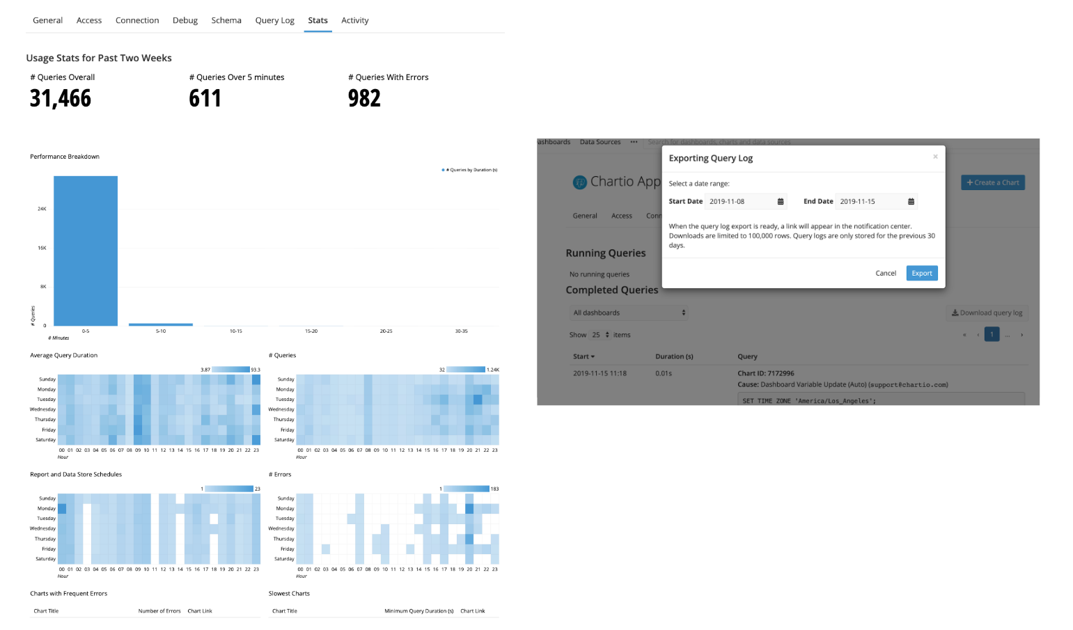
As Chartio usage expanded within organizations, so did the need to optimize. To help address this issue, we added a data source “stats” tab containing useful information—powered by the query log—to help diagnose common problems, highlight problematic charts, and summarize usage.
In addition, we improved our download feature by adding the ability to specify date ranges and increasing the speed of download.
But it wasn’t enough.
There were so many ways to explore and visualize the query log data, providing one stats tab was simply inefficient. Our Data Advisors still found themselves creating custom reports for customers to provide additional insights. We needed a better way to empower our users to get their own answers.
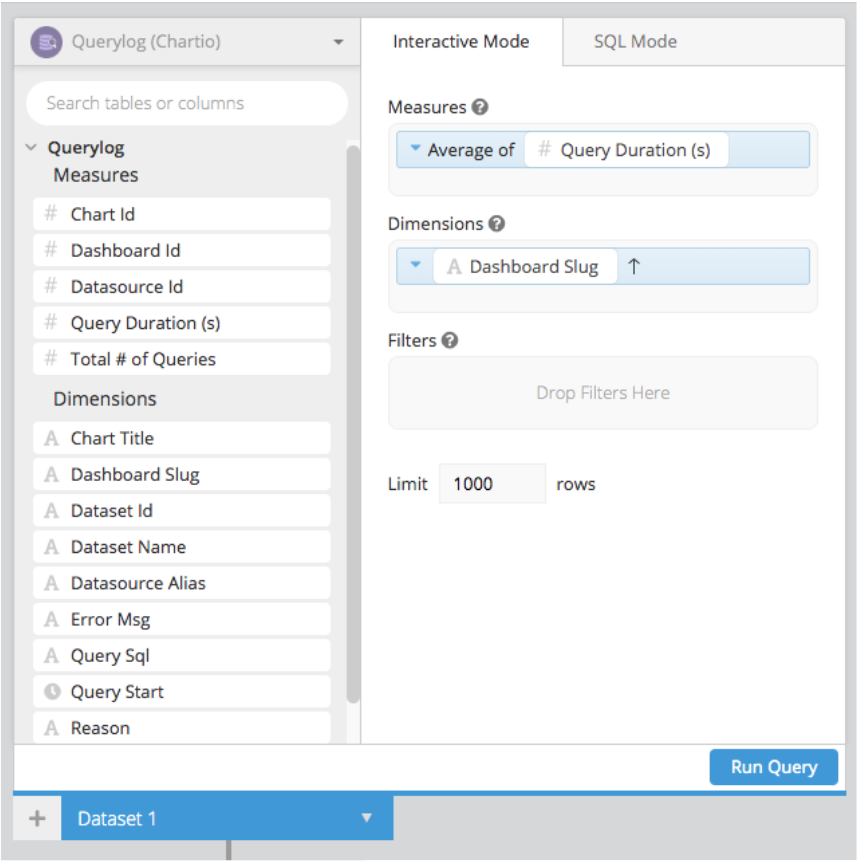
That’s why in the first half of 2019, our team made it a priority to help teams easily manage and diagnose performance bottlenecks. Through this objective, we released a new and improved query log which could be added as a datasource within Chartio. By having the query log as a direct source in Chartio, users can now query and visualize the data any way they want, with up-to-date results. The custom reports we were once building for customers can now be created directly within a customer’s instance.
Using data to optimize
In addition to improving our query log for performance, we’ve also added additional fields to provide more context around the executed queries. New fields include: user who executed the query, query reason, rate limiting information, and more granular Chartio-specific details.
With the query log source, you can:
- See which queries have been executed against all data sources
- Find out why queries were executed
- Discover which charts and dashboards are taking up the most database query time
- Identify your most-used dashboards and charts
- Monitor your overall data source usage in Chartio
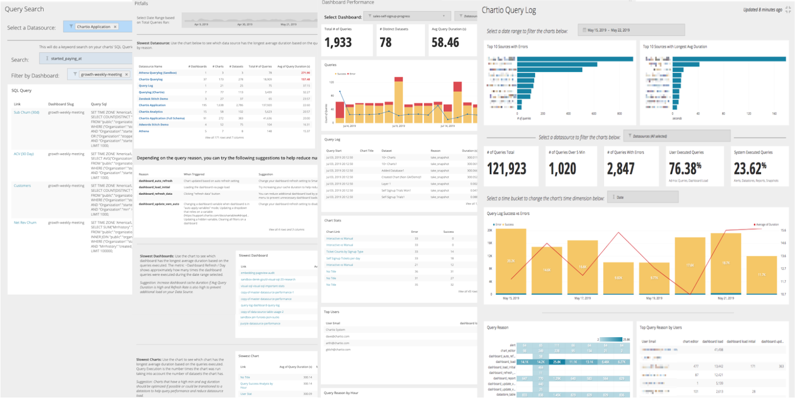
The query log source also comes with a set of dashboards that contains various sample queries that highlight overall query usage across all data sources:
Chartio Query Log
A comprehensive overview of all your data sources connected in Chartio. This dashboard contains charts that highlight query performance across all your data sources to help identify performance bottlenecks.
Dashboard Performance
A single detail view of a dashboard’s performance stats. This dashboard is great for isolating slow or error-prone dashboards and understanding what’s happening—and why.
Pitfalls
A dashboard that highlights commonly-found pitfalls that lead to poor query/dashboard performance. Each chart identifies a pitfall and a potential solution.
Query Search
A lookup tool that allows you to search for column or table usage. This dashboard is great for understanding how and where the column or table is used.
This is just the start of what you can do with the query log as a data source. Over the past few years, we’ve seen many great dashboards built for internal and external uses, but none more popular than performance-related dashboards. Chartio customers have built investigative dashboards to track problem queries, or monitoring dashboards to understand usage by user. Internally we’ve used this data source to identify all of our scheduled jobs, like reports and snapshots, and distribute them across the day to reduce load during peak hours for user queries.
If you’re interested in exploring your own query log, email support@chartio.com to find out more.
