Introducing the New and Improved Chartio Website
Posted by on August 22, 2011 Features
Here at Chartio, we know that good design is crucial.
That’s why we’re particularly excited to launch our fully-redesigned, dare-we-say-beautiful homepage, which elegantly and effectively conveys what we’re all about.
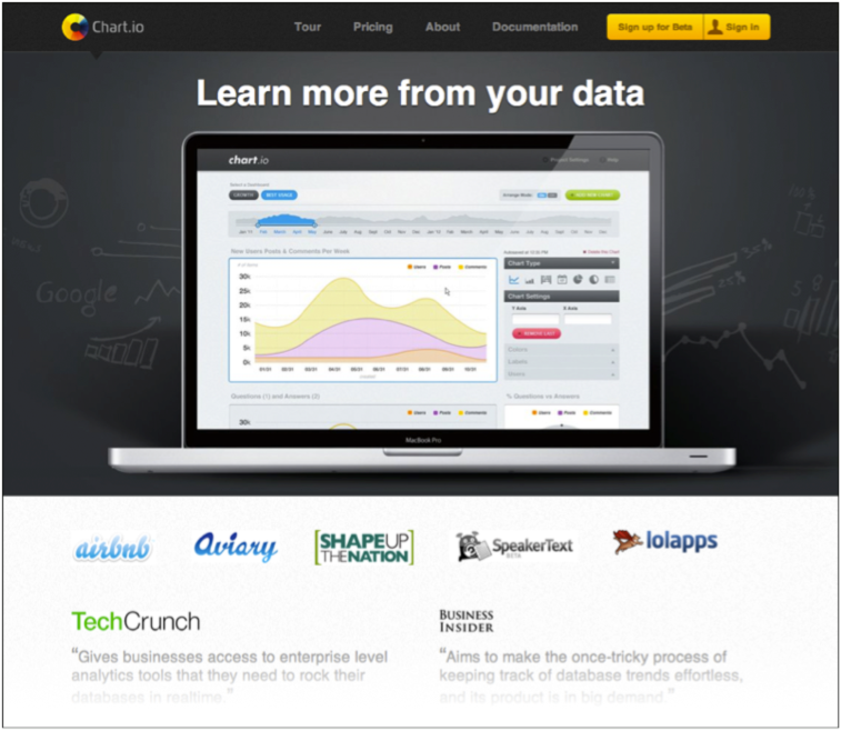
Some highlights of the new site include:
One-page design
No need to navigate from page to page – all the information you want is right here. Just click any of the top menu items, and the homepage quickly and fluidly scrolls to your chosen topic.
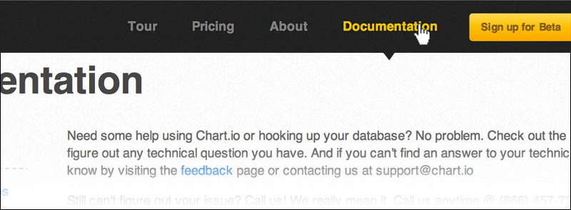
Chartio is committed to making the content you want as accessible as possible, and now our homepage is no exception.
Clean and simple
No clutter or confusion – the page elements are big and bold, with no unnecessary distractions.
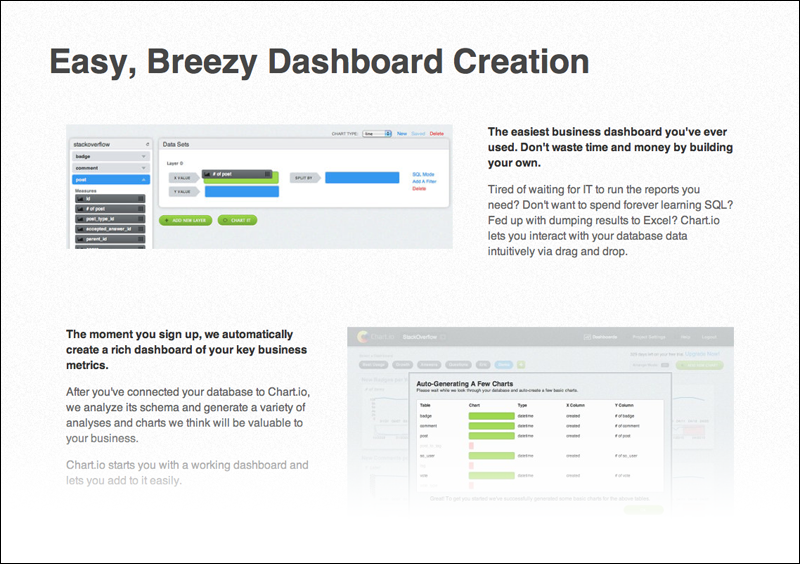
Again, it’s just like our product – getting information from our website is as easy and enjoyable as getting insight into your data with Chartio.
The same great content
Our homepage is still packed with plenty of product and company details, like side-by-side feature highlights, pricing plans, founder bios, and documentation.

It’s everything you want to know about Chartio, all in one place.
We’re pretty proud of our new design, but we could be biased. So, by all means, check out the new Chartio, and let us know what you think!

