Add a target line to your chart
There may be times where you’re looking to compare a chart’s results against a certain data point. You can do this by adding a target line to your chart using Annotations or creating a target column in your chart.
Annotation
You can easily add an Annotation to your chart in your chart settings if you prefer to add a static target value. Annotations are especially useful if your chart has a dual axis or contains a large number of columns.
Column
Another option is to directly add your target amount within your chart as a separate Target column.
In the following example, we created a Bar chart that outlines the number of users per month using our Dundersign Demo Data data source. We have a goal of 5,500 users per month and would like to visualize our progress against this goal.
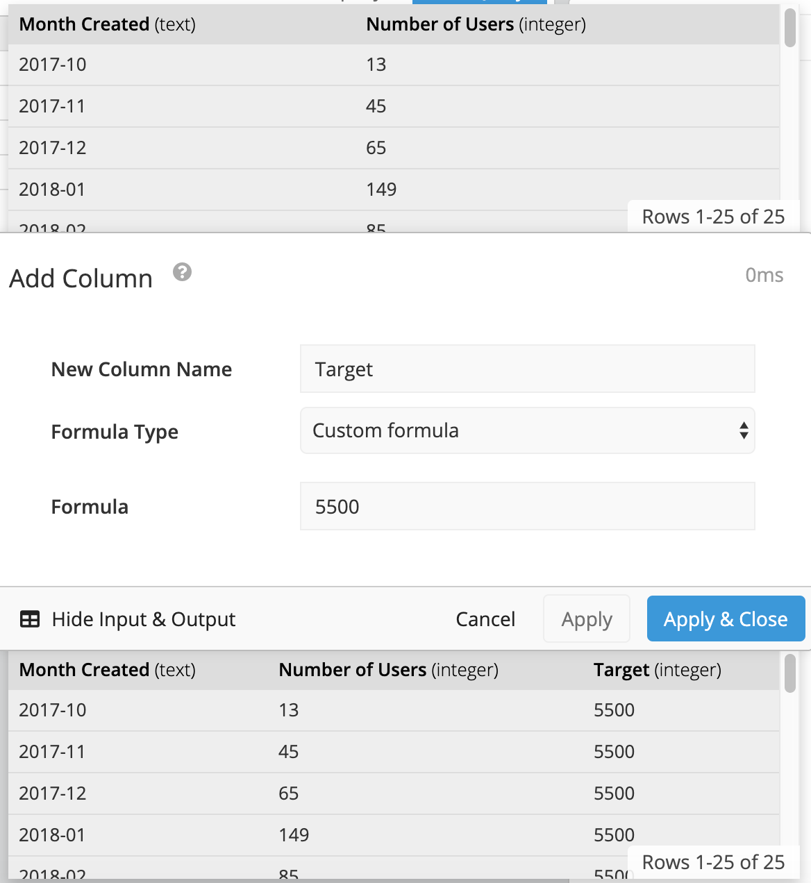
If your target value is already available within your database, you can simply add the column to your chart’s query. If that data doesn’t exist in your database, you can create a new column using a Formula Column Action (Visual SQL) or an Add Column Pipeline Step (Data Explorer), selecting Custom Formula for the formula type, then assigning a static value to the column (e.g. 5500) that will show as the benchmark for every time period.
| In the Visual SQL interface |
|---|
 |
| In the Data Explorer interface |
|---|
 |
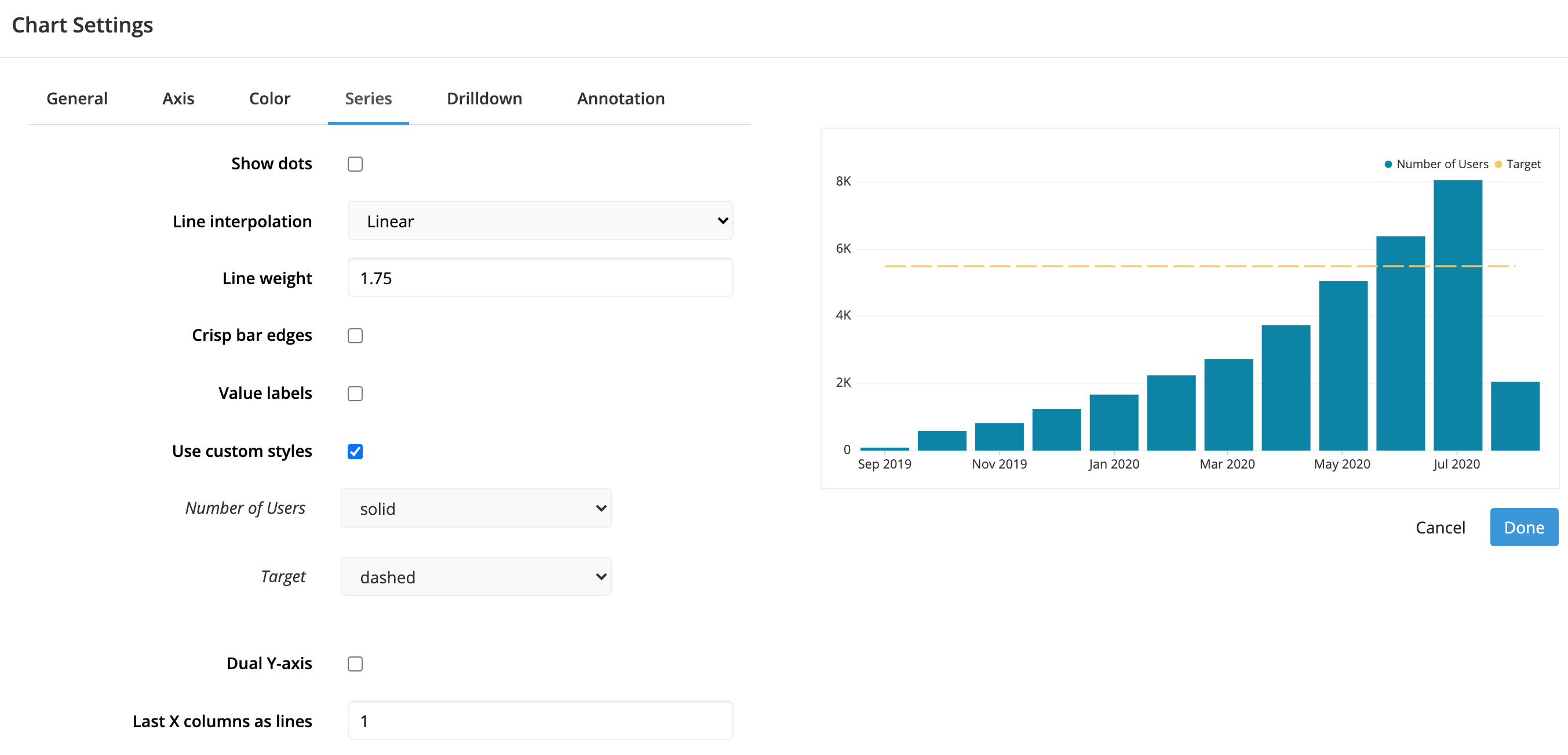
We recommend setting the chart type to a Bar Line chart to allow your target line to show up as a line and differentiate it from the rest of your data.
Customize your target line
When adding a target line as a column in your chart, you also have the option of customizing the line’s value using formulas, Dashboard Controls, Relative Dates, or other non-static values.
Once your target line is set, you can also customize how the line is displayed on your chart via the Series tab in the chart settings. From there, you can set a thicker line width, choose to whether or not to show dots on the line, and even set how the line looks by clicking the Use custom styles checkbox and selecting the desired line style.
Make sure to click Done and save your chart once you’re done editing the settings.


