Table formats for Bar, Line, and Area charts
Bar, Area, and Line charts all accept a similar table format. Here’s a brief explanation of the types of table formats these charts accept, along with chart examples.
In the Visual SQL interface
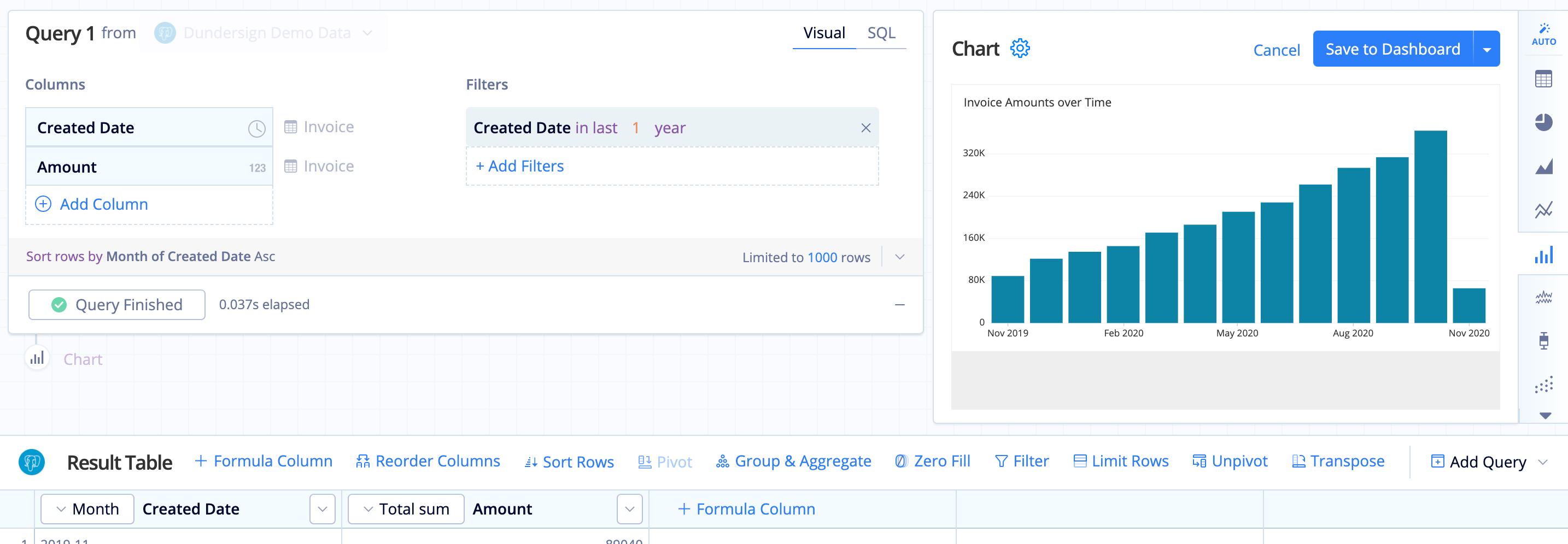
One aggregated column and one grouped column
One aggregated column and one grouped column:
- The first column (the grouped column) maps to the x-axis
- The second column (the aggregated column) maps to the y-axis
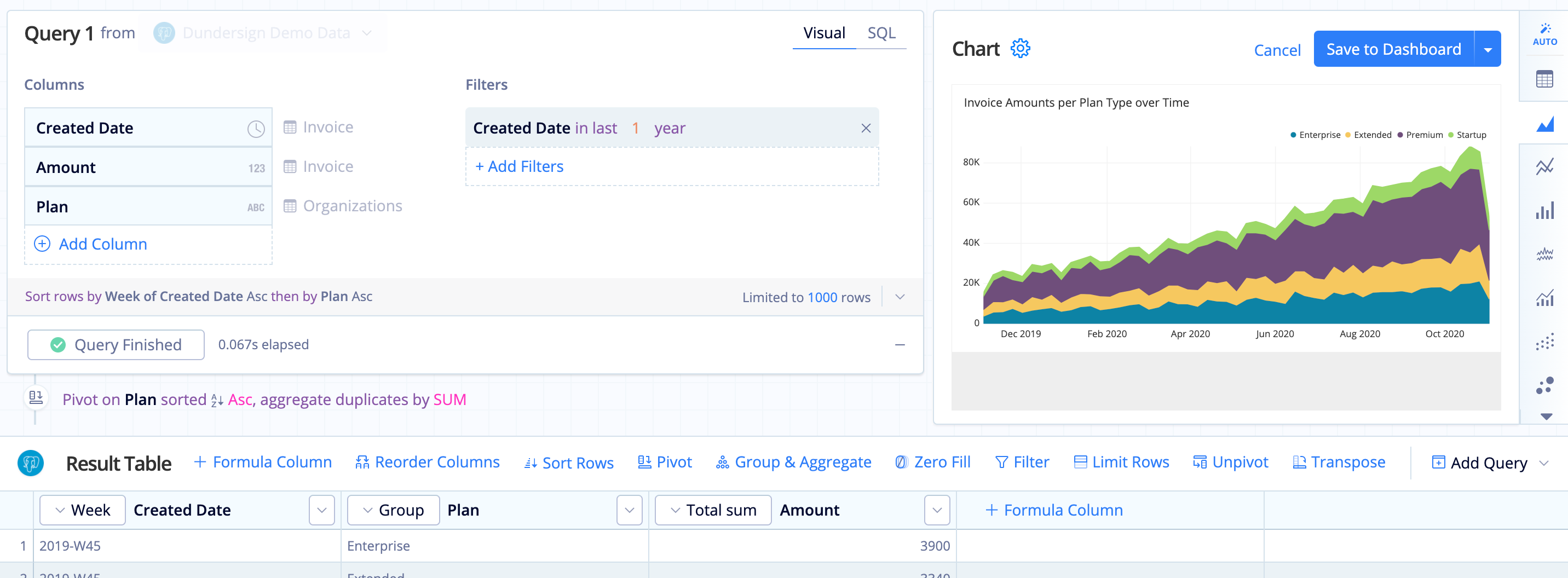
One aggregated column and two grouped columns
To make this result set compatible with Bar charts, you need to use a Pivot Action on the second column (the second grouped column). This turns the second column’s values into column headers.
- The first (grouped) column maps to the x-axis
- After the Pivot, subsequent columns map to the y-axis and are grouped and labeled by their column name.
Pivot with two aggregated columns
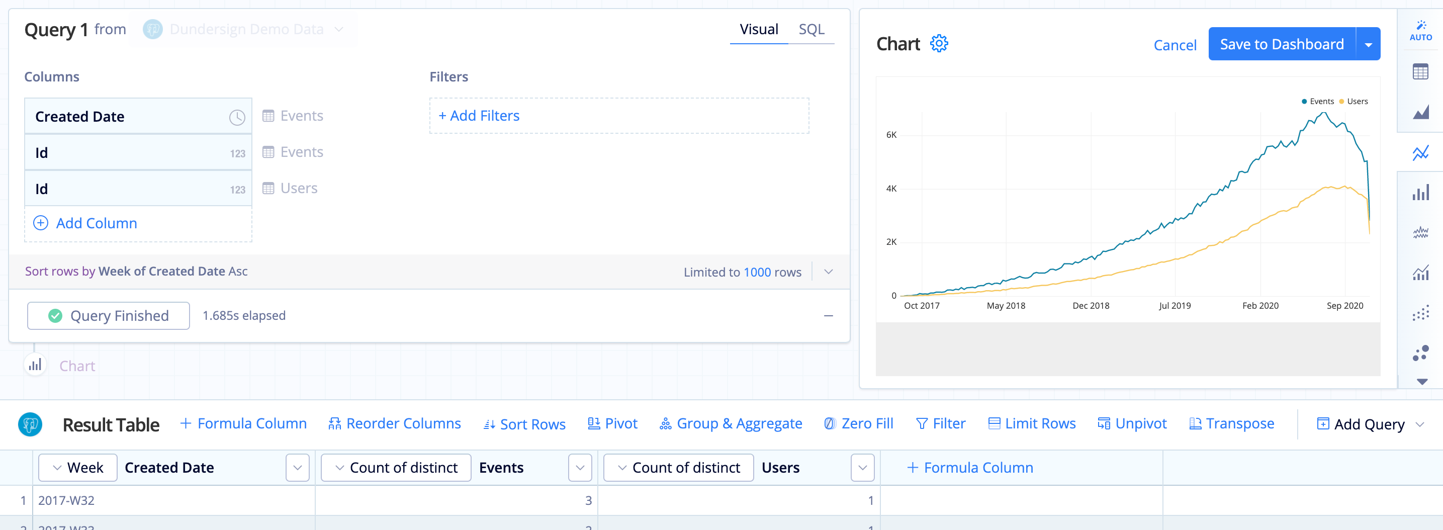
Multiple aggregated columns and one grouped column
- The first column maps to the x-axis
- Subsequent columns map to the y-axis and are grouped and labeled by their column name
- Tooltip displays second through last column’s values when hovering on the chart preview
Number of lines in a Bar Line chart
For an example of Bar Line chart with multiple lines, check out our Dual axis Line charts article.
In the Data Explorer interface
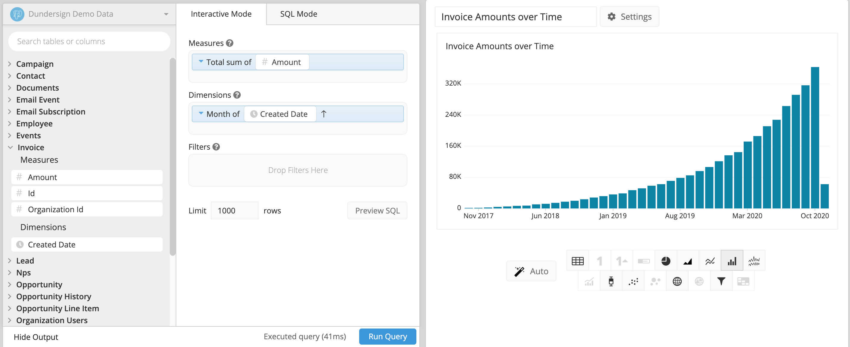
One measure grouped by one dimension
- The first column maps to x-axis.
- The second column maps to y-axis.
Sample table

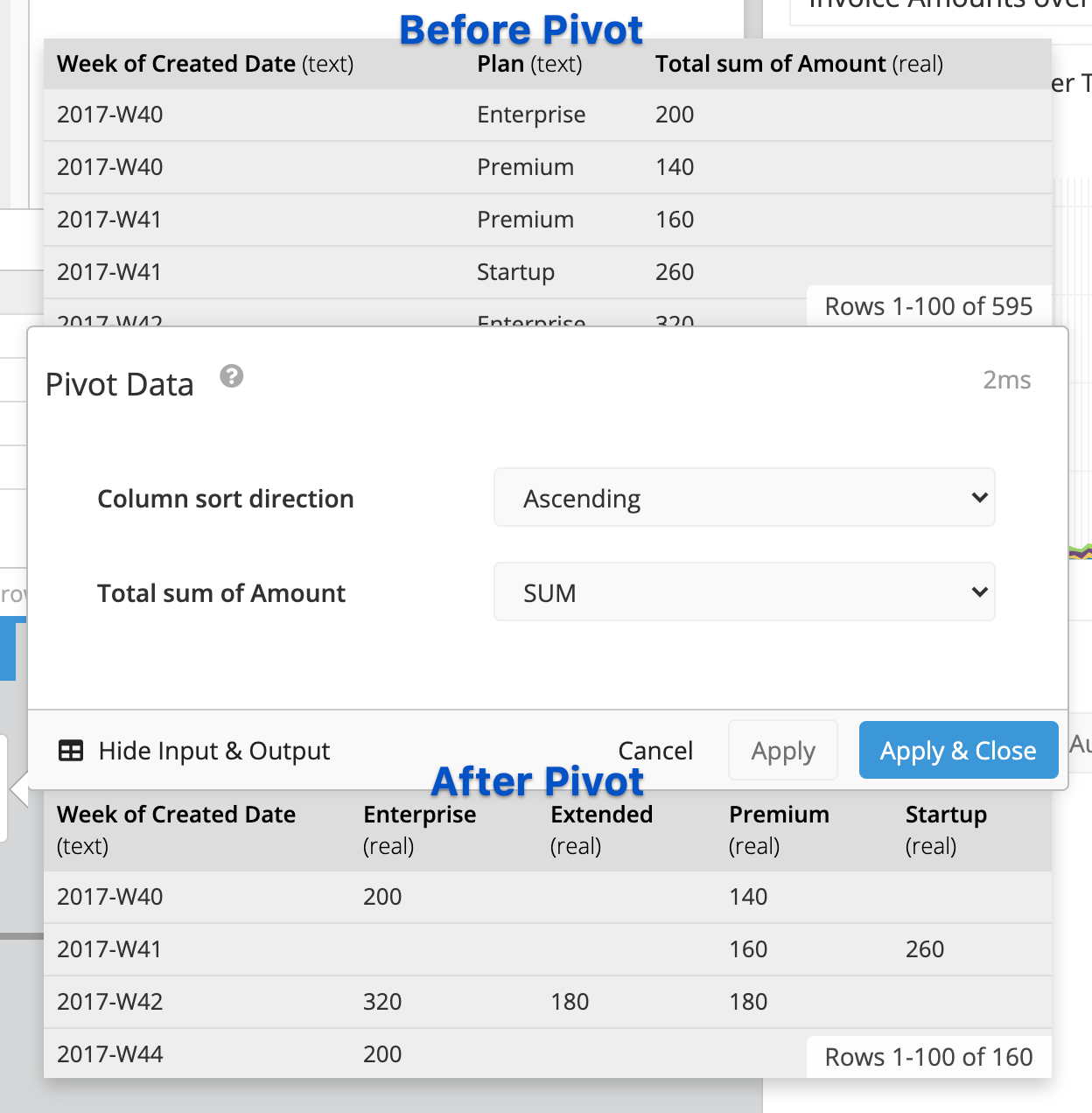
One measure grouped by two dimensions
- Add a Pivot step, which allows the second column’s values to each become a new column. View an example of a Pivot here.
- The first column maps to x-axis.
- After the Pivot, subsequent columns map to the y-axis and are grouped and labeled by their column name.
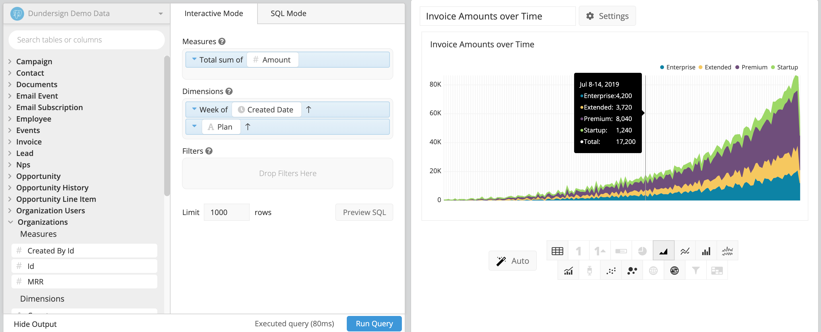
Sample table (before and after Pivot step)
Pivot with two measures
First, let’s take a look at an example chart before and after a Pivot. Our example chart is grouped by two dimensions: Date and Customer. There are two aggregate columns: Amount and Count of Orders.
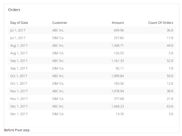
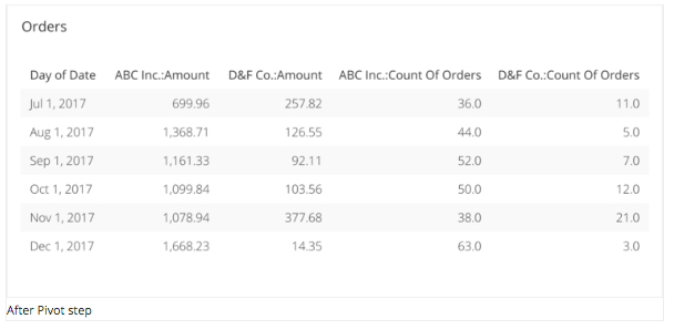
Here’s what our chart looks like in the Data Explorer:
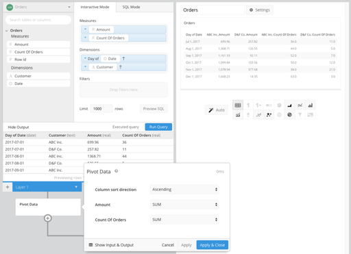
The second dimension, Customer, is pivoted so the values are displayed/grouped with our column headers for our measures (Amount and Count of Orders). This type of pivot requires the following criteria:
- Grouped by exactly two dimensions
- Two or more measures (aggregates)
- Second (pivoted) dimension must have a limited number of values, otherwise, it will produce a large number of columns. (The limit in Chartio is 200 columns per table chart, though you would likely want far fewer than that to produce for legibility.)
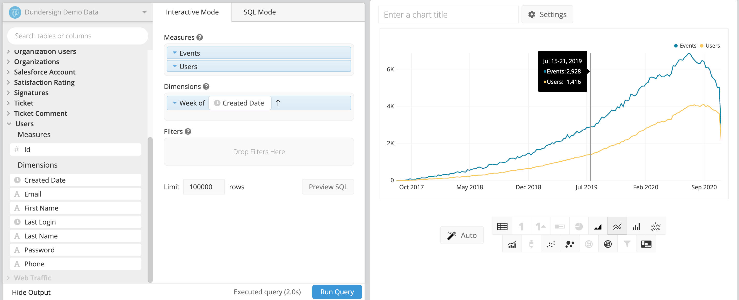
Multiple measures grouped by one dimension
- First column maps to x-axis.
- Subsequent columns are mapped to the y-axis, and are grouped and labeled by their column name.
- Tooltip displays second through last column on hover.
Sample table
