Usage Stats
Usage stats at the data source level
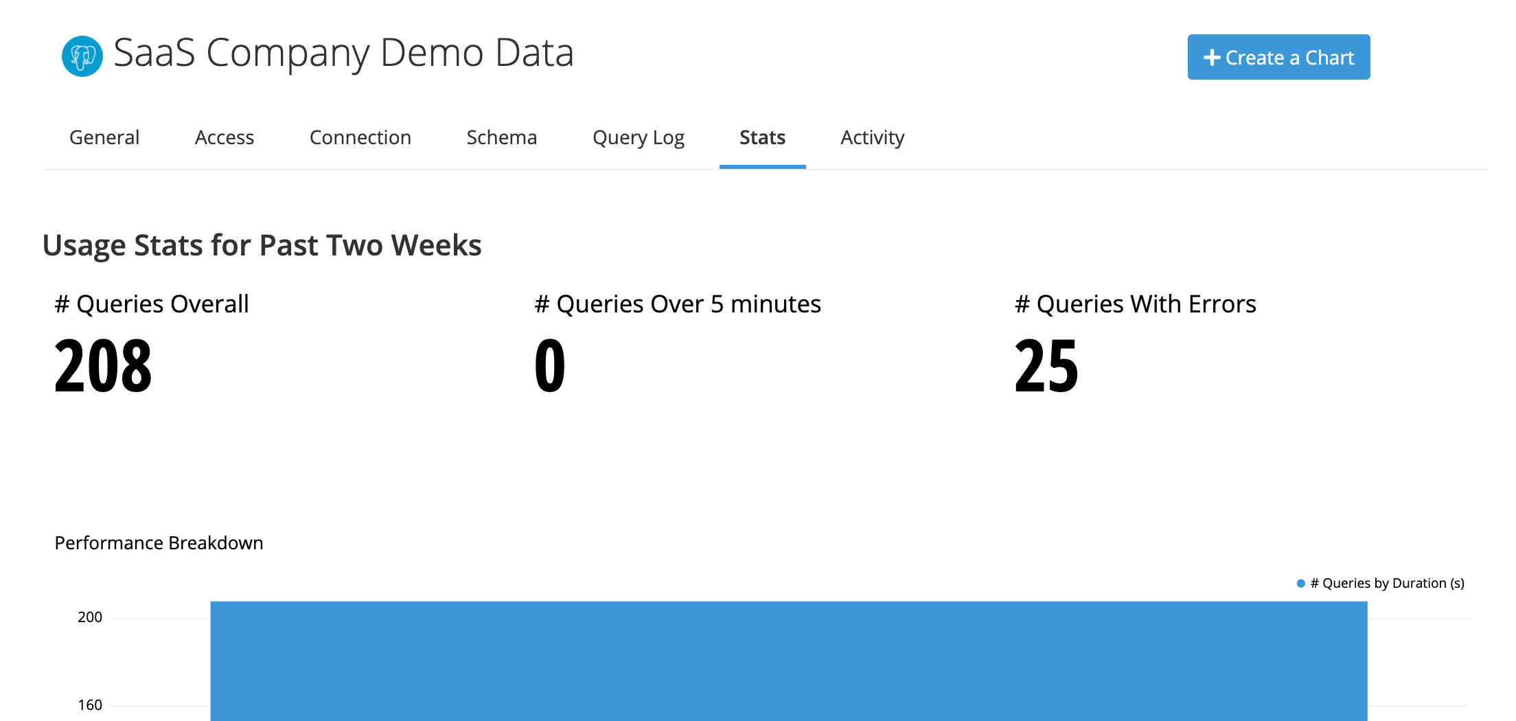
Switch to the Stats tab in your data source’s settings to view statistics about the queries run on your data source in the past two weeks.

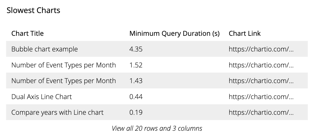
An easy way to improve database performance is to take a look at the Slowest Charts and begin optimization there. You can also easily see what time of day your database processes the most queries in # Queries chart and which charts have the most errors in Charts with Frequent Errors.

Another particularly helpful chart on this page is the Report and Data Store Schedules Heat Map, which shows the number of scheduled jobs for a particular day and time of the week. If there are any high traffic times highlighted in this chart, you can take action by updating the scheduled times for your Email Reports and Data Store refreshes, which could improve your data source’s performance.
Usage stats at the organization level
Permissions required: Owner
The Usage Stats page is a Chartio generated in-app embedded dashboard with several charts that can be used to gain insight into your organization’s Chartio usage. The Usage Stats page for your Chartio instance is available by clicking Admin from the top navigation bar and selecting Usage Stats from the available options.
Note: If this option is not available, please contact Chartio Support at support@chartio.com and we’ll activate this for your organization.
The Usage Stats dashboard includes charts with information about your dashboards, charts, data sources, users, and configured reports. Each chart has a unique set of metrics tailored to provide information on how that component is being utilized in Chartio. With this information, you can easily determine the last person to view or edit a dashboard, or which dashboards have scheduled reports or snapshots activated among many other things.
If you’d like to filter the information in the charts, you can click the View all rows link to open a modal window that will allow you to sort and filter the charts. Sometimes you may want to make changes to these charts, but this is not allowed on the Usage Stats page. However, you can click the “View all rows” link for a chart and download the chart as a CSV file. This CSV can then be added to Chartio as a new data source where you can manipulate and filter the data further to create custom usage reports.
We’re constantly evaluating our product and love to hear user’s feedback, so if there’s a particular metric you’d like to see added to the Usage Stats page, please contact Chartio Support and we’ll submit a feature request for you.