There are myriad explanations of the math and statistics behind creating a bell curve and what a bell curve is. We aren’t going to get too into the statistics, the math, or the history of the Bell Curve, or the Gaussian Curve, and its uses. We’re going to keep this simple. We’re going to show you how to array a normal distribution over ANY data set using a few SQL principles and the Normal Distribution equation.
Step 1: First, let’s get a data set. From the Chartio Demo Source we are going to find out how much each organization is paying for our demo SaaS Company’s service.
We can do this in Chartio’s Interactive Mode here:
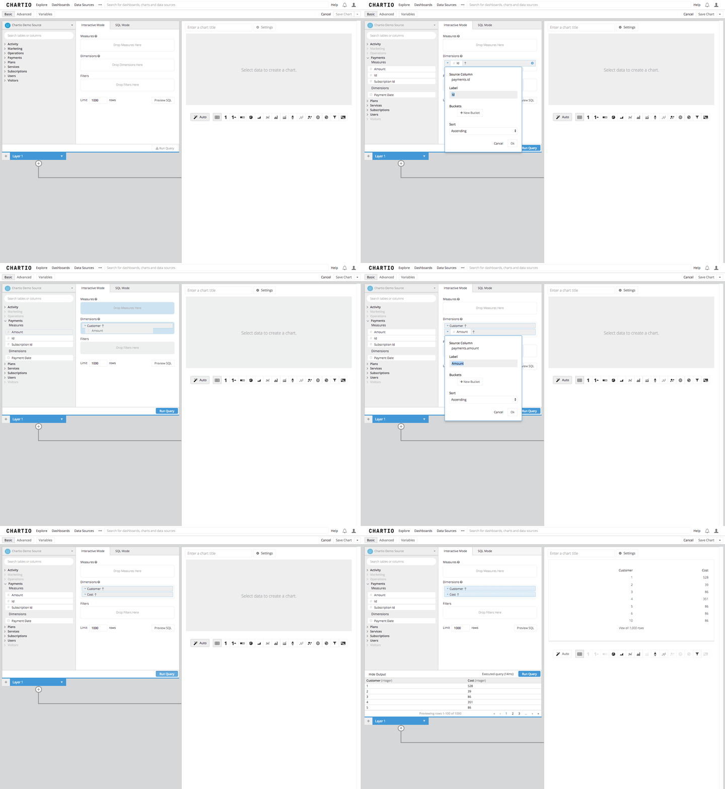
This next part is important; we’re going to need the SQL that was built automatically by the query builder for future steps in this process. Click on the “Preview SQL” button, or switch to SQL Mode and copy that SQL to your clipboard.
Step 2: Second, now that we know the entire range of our underlying dataset, we can generate what the normally distributed numbers in that data set would look like.
Since we can safely assume that in a normal distribution every single potential answer in the data set of integers would have a value on the curve, let’s just use generate series to create our range of numbers. In the series generation command lets use the minimum and maximum of our data series as the start and stop of our series, respectively, and leave the interval as 1 to get every single integer in our new data set on the curve. This will give us a range that counts from our minimum value to our maximum value by single integers.
with
data_set as
(
SELECT "Payments"."id" AS "Customer",
       "Payments"."amount" AS "Cost"
FROM "public"."payments" AS "Payments"
GROUP BY "Customer",
         "Cost"
ORDER BY "Customer" ASC,
         "Cost" ASC
)

select
        generate_series(min("Cost"),max("Cost"),1) as series from data_set
Step 3: The equation we’ll be using to calculate the probability density of our distribution has a lot of important pieces. The probability density equation (shown below) can look pretty daunting, but I promise it isn’t that hard. Searching on Youtube for “Normal Distribution Probability Density Equation” gets you over 25,000 results.
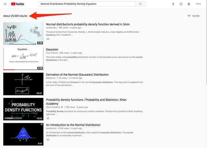
If you don’t have much experience with the idea of Normal Distribution, or it’s function, I highly recommend checking one of these out before you go forward, my personal favorite is this one. These math and statistics experts will be able to explain these concepts to you in a much better way than I can.
The equation that we’ll use, as outlined in the video I linked above, is here:
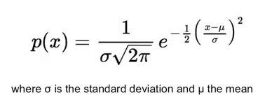
There are three pieces of this equation that aren’t constants:
- The Standard Deviation represented by the greek letter sigma or “σ”
- The Mean or Average represented by the greek letter mu or “µ”
- The specific item in the population or number in a series represented by “x”. X is fairly easy to come by and we did that in Step 2 when we came up with our series.
Standard Deviation and Average are also pretty easy to calculate once you know your series because there are built in functions in many SQL languages.
In our example PostgreSQL has built in formulas for Standard Deviation and Average, which will be our stand in for the mean in this case as arithmetically they are the same for our purposes and no “mean” function exists in PostgreSQL. MySQL and Microsoft SQL both have functions for average and standard deviation.
with
data_set as
(
SELECT "Payments"."id" AS "Customer",
       "Payments"."amount" AS "Cost"
FROM "public"."payments" AS "Payments"
GROUP BY "Customer",
         "Cost"
ORDER BY "Customer" ASC,
         "Cost" ASC
),

series as
(
select
        generate_series(min("Cost"),max("Cost"),1) as series from data_set
)

select
    stddev(series) as stddev,
    avg(series) as avg
from
    series
Step 4: The next steps that we need to take are meant to get all of the requisite pieces of information in the same line in order to conduct the calculation. There are other ways of accomplishing this but for our purposes, we will keep these on the same line in order to visualize the calculations.
In this vein, let’s get the Standard Deviation and Average from Step 3 in columns that will show these values on all rows. We’ll use a cross join for that and we will join all of the columns from our table “series” and all columns from our table “stats.”
with
data_set as
(
SELECT "Payments"."id" AS "Customer",
       "Payments"."amount" AS "Cost"
FROM "public"."payments" AS "Payments"
GROUP BY "Customer",
         "Cost"
ORDER BY "Customer" ASC,
         "Cost" ASC
),

series as
(
select
        generate_series(min("Cost"),max("Cost"),1) as series from data_set
),

stats as
(
select
    stddev(series) as stddev,
    avg(series) as avg
from
    series
)

select *
from series
cross join stats
Step 5a: Now that we have the variables that are going to go into the equation we need, let’s get that big equation we mentioned above into straight forward SQL syntax, and that looks like this:
exp((-.5*((@((series-avg)/stddev))^2)))/(SQRT(2*PI()))
In the full SQL query it looks like this:
with
data_set as
(
SELECT "Payments"."id" AS "Customer",
       "Payments"."amount" AS "Cost"
FROM "public"."payments" AS "Payments"
GROUP BY "Customer",
         "Cost"
ORDER BY "Customer" ASC,
         "Cost" ASC
),

series as
(
select
        generate_series(min("Cost"),max("Cost"),1) as series from data_set
),

stats as
(
select
    stddev(series) as stddev,
    avg(series) as avg
from
    series
),

data_set2 as
(
select *
from series
cross join stats
)

select
    series
    ,exp((-.5*((@((series-avg)/stddev))^2)))/(SQRT(2*PI())) as "Normal"
from data_set2
Step 5b: The results of this query are going to be the positions on the y-axis of our chart that builds your curve. Once this table is queried from your source you can then select Line Chart in Chartio’s Data Explorer and you’ll have created a bell shaped Gaussian Curve.
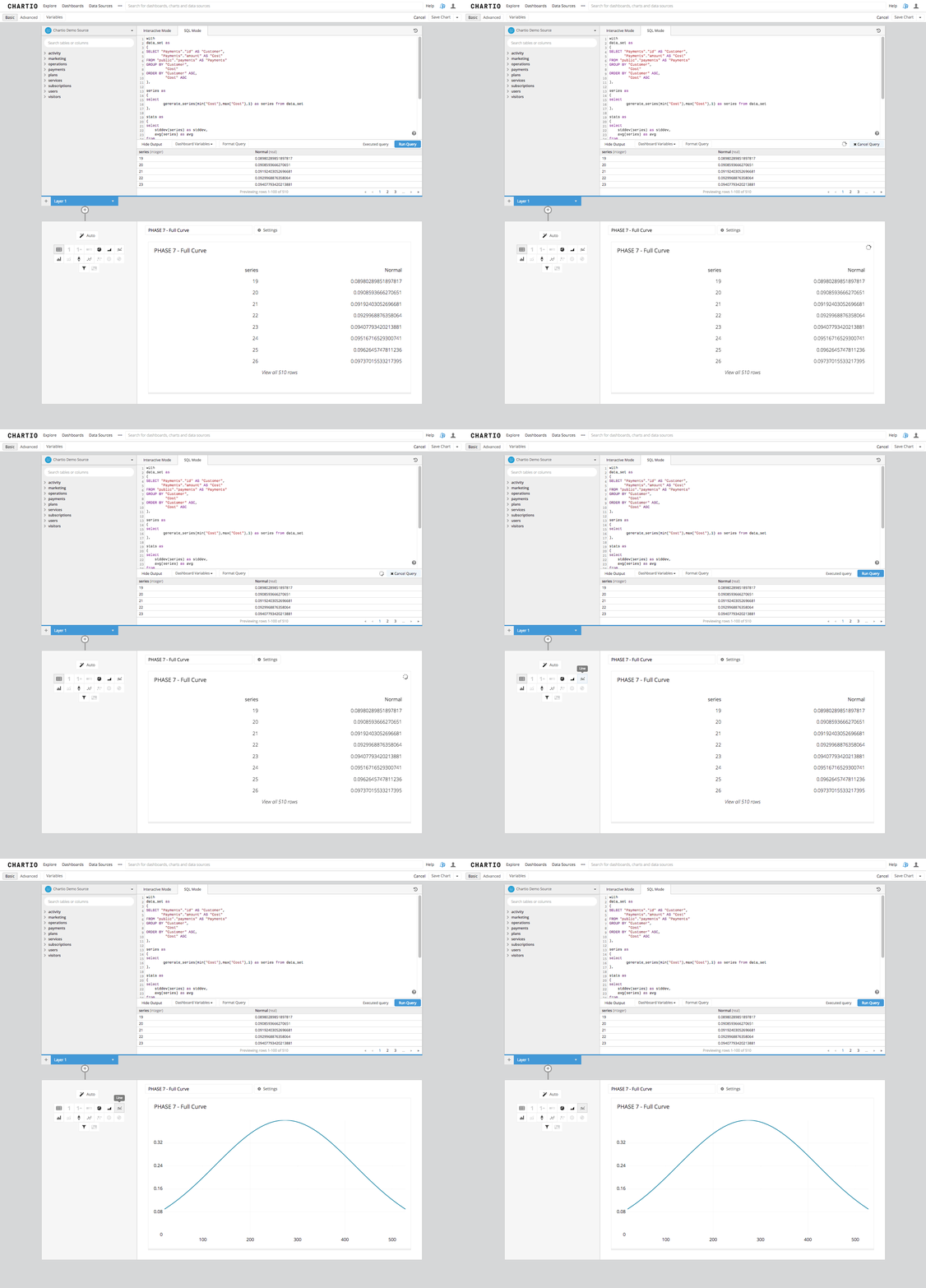
Step 6: Now, what we have done is taken an underlying data set and found what a normal distribution of results within that population would look like. From that curve we can not yet make any real determinations of any particular record in this data set. All we can do is see what the result set would look like if the population of results were distributed “normally.”
In reality this kind of distribution almost never happens, so we are using our underlying data set and making an assumption in order to determine where a real result might be on that curve. Let’s see what that would look like by plotting a real data point on the curve.
First let’s use the information we created in Step 3 and plot a line where the mean, and the first Standard Deviation from the mean in each direction lay on this chart. Statistically this will reveal to us the span in which 68% of our results will fall in our normalized distribution.
In the chart we’ve already created let’s add a second layer so we can create a new query and send it to the same data source. In that query we are going to use the same underlying data set, the same series section, and the same Standard Deviation and Average section. We will then add in a section that calculates the three markers that break our curve into sections, we will calculate the mean and the mean minus 1 Standard Deviation and the mean plus 1 Standard Deviation. Fairly easy right? Yep, take a look below to see what this looks like.
with
data_set as
(
SELECT "Payments"."id" AS "Customer",
       "Payments"."amount" AS "Cost"
FROM "public"."payments" AS "Payments"
GROUP BY "Customer",
         "Cost"
ORDER BY "Customer" ASC,
         "Cost" ASC
),

series as
(
select
        generate_series(min("Cost"),max("Cost"),1) as series from data_set
),

stats as
(
select
  stddev(series) as stddev,
  avg(series) as avg
from
  series
)

select avg as "Dist", 1 as "Measure" from stats
UNION ALL
select avg-stddev as "Dist", 1 as "Measure" from stats
UNION ALL
select avg+stddev as "Dist", 1 as "Measure" from stats
Then we need to add in a re-order columns step to get the Normal column into last position and then we need to select a bar line chart. This gives us bars in the 3 stats positions as we described and shows them arrayed over the Normal Curve.
Step 7: Finally we can add in a line that changes based on the selection from a drop down. This drop down we can build as a Chartio Environment Variable in the dashboard and select the Company Name as the Filter. Then using the company filter in the filters box and selecting the maximum amount of payment for the specific company by adding the Amount column to the measures box and using the maximum aggregation.
In Step 6 we added the value of 1 to the statistics measures we found, and that was just to make sure the bar we were drawing had an appearance of the total height of the chart we are showing, so we will add the same type of column to layer 3 in our chart in the data pipeline using an “Add Column” step. Then joining to our other two layers on an outer join, and then ordering the columns again to make sure our Normal column is the last column to the right of our table we will have a Bar/Line Chart with 4 bars and 1 line. You can set the colors of the series in the settings screen of the chart to get the chart to appear how you desire.
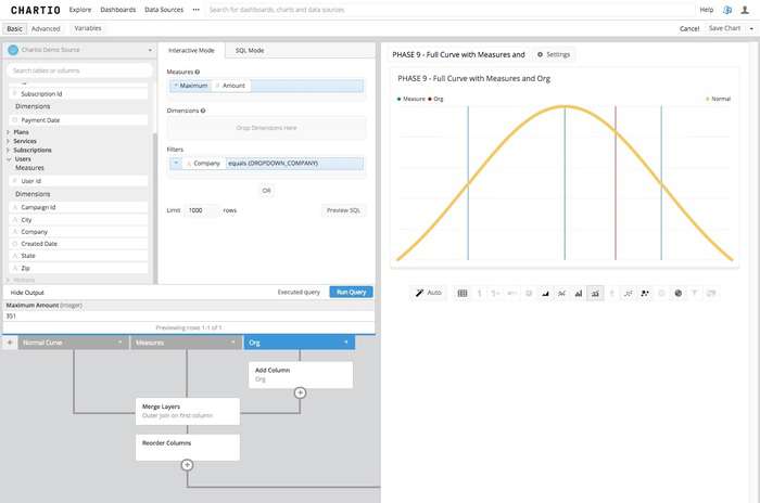
We have now taken a data set from our data tables and forced a normal curve on this data set, by assuming a totally normal distribution. We then applied some basic statistical metrics and finally added in an actual measure of one of our clients to find where in a normalized distribution this client would fall, if the client pool was a normally distributed population. Which is very rarely the case.